In Times Square, the crossroads of the world, where ad spaces are highly sought after, capturing and retaining viewers' attention is paramount. One of the most effective ways to do this is through the strategic use of colour in advertising.
Colour psychology plays a crucial role in how viewers perceive and engage with advertisements. When used thoughtfully, colours can evoke specific emotions and reinforce brand messaging.
Aligning Colors With Brand Identity
To effectively align colour with your brand message, start by understanding your brand's personality and values. Choose colours that reflect these attributes and resonate with your target audience. For example, if your brand is youthful and energetic, vibrant colours like red or orange can convey this message effectively.
Creating Visual Impact in High-Traffic Areas
In highly trafficked areas like Times Square, where thousands of people pass by daily, it is essential to create visual impact. Bold and contrasting colours can help your ad stand out amidst the surrounding noise. Use colours that complement each other to create a visually appealing and memorable ad.
Reinforcing Brand Messaging Through Color
Consistency is key when aligning colours with your brand message. Use colours that are already associated with your brand to reinforce brand recognition. For example, if your brand's logo is blue and white, incorporating these colours into your ad can help strengthen brand association in viewers' minds.
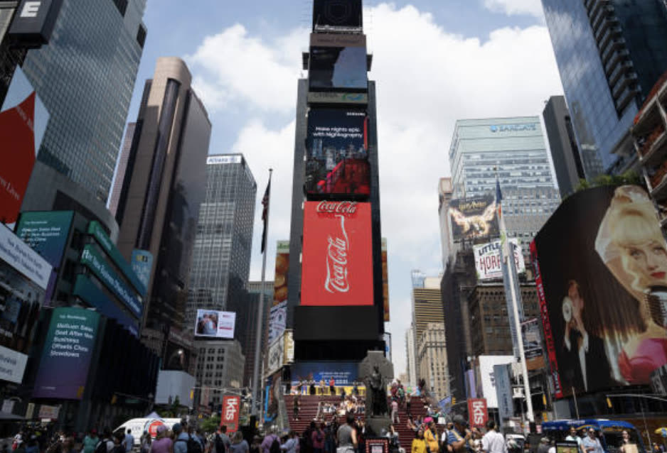
Historical Examples of Colorful Advertising
Coca-Cola's Red and White Holiday Campaigns. Coca-Cola's use of red and white in its holiday advertising, dating back to the 1930s, has become iconic. The combination of these colours has become synonymous with the holiday season and is instantly recognizable, evoking feelings of warmth and nostalgia.
Apple's Silhouette iPod Campaign. Apple's iPod silhouette ads, featuring vibrant colours against a stark black background, were highly memorable. The use of bold, contrasting colours highlighted the product's sleek design and simplicity, leaving a lasting impression on viewers.
M&M's Melt in Your Mouth, Not in Your Hands. M&M's commercials featuring the colourful candy shells and the slogan have become a classic example of using colour to create brand recognition. Each colour represents a different flavour, and the bright, playful colours have helped make M&M's one of the most recognizable candy brands worldwide.
Staying Ahead of the Curve
The thought put into colour is just as important as the message itself. However, it is crucial to be ahead of the curve, as some colours become trendy and you do not want to get lost in a sea of the same shade. Standing out means going against the trend and being bold in your colour choices, ensuring your brand remains distinct and memorable.
Crafting a masterpiece in advertising requires not only a thoughtful message but also an innovative approach to colour. Stand out by staying ahead of trends and daring to be different.
We have helped Mary Kay paint the town pink with a city takeover, creating a campaign that is instantly recognizable. Now, we are ready to work our magic for your brand, ensuring it stands out in the crowd.